TECHERICS
CSS Gradient Generator: Linear, Radial & Conic Gradients With Copy-Paste Examples
Learn linear, radial and conic CSS gradients — the 135deg angle rule, fixes for muddy middles and banding, and seven copy-paste recipes you can use today.

Contents
- 7 copy-paste recipes
- 1. Hero section — the classic diagonal
- 2. Dark overlay for text over a photo
- 3. Button with a smooth two-colour blend
- 4. Gradient text for a big heading
- 5. A soft spotlight glow behind a product
- 6. A pie chart with no JavaScript
- 7. Stripes with hard stops
- The three types, side by side
- The angle trap, once more
- Why gradients turn muddy (and how to fix it)
- Banding: the steps you can see
- Gradient text and borders, done right
- 5 mistakes to avoid
- The short version
Most CSS gradients go wrong in the same place: the angle. Someone writes linear-gradient(45deg, ...) expecting a diagonal from top-left to bottom-right, and gets the opposite diagonal instead. The gradient is not broken — the angle convention is just not what you learned in maths class. In CSS, 0deg points up, and angles increase clockwise. So to right is 90deg, and the top-left → bottom-right diagonal everyone wants is 135deg, not 45deg.
Once you know that one rule, the rest of gradients is easy. This guide gives you the three types, the fixes for the two ugliest problems (the muddy middle and banding), and seven copy-paste recipes you can drop straight into a stylesheet — or build visually in the free CSS Gradient Generator, which shows a live preview and copies clean CSS for you.
7 copy-paste recipes
Use these as they are, or paste them into the generator and tweak the colours. Every one of them works in all modern browsers with no prefixes.
1. Hero section — the classic diagonal
.hero { background: linear-gradient(135deg, #2563eb, #7c3aed); }The 135-degree diagonal is the workhorse. It looks dynamic without looking tilted, and it hides banding better than a straight vertical fade.
2. Dark overlay for text over a photo
.hero-overlay { background: linear-gradient(180deg, transparent 0%, rgba(0, 0, 0, 0.7) 100%); }The top stays clear so the photo shows through, the bottom darkens so white text stays readable. This pattern is on half the hero images on the internet.
3. Button with a smooth two-colour blend
.button { background: linear-gradient(to right, #6366f1, #ec4899); }Left to right reads naturally for western readers. Keep the two colours close on the colour wheel (indigo → pink) and it looks polished, not loud.
4. Gradient text for a big heading
.title { background: linear-gradient(90deg, #6366f1, #ec4899); -webkit-background-clip: text; background-clip: text; color: transparent; }The gradient fills the letters themselves. Keep it for large headings only, check the contrast at both ends, and remember the text stays selectable and readable by search engines.
5. A soft spotlight glow behind a product
.glow { background: radial-gradient(circle at 30% 20%, #fef3c7, #f97316); }Radial gradients spread out from a centre point. Move the centre with at 30% 20% and you get a realistic spotlight instead of a generic blob.
6. A pie chart with no JavaScript
.pie { border-radius: 50%; background: conic-gradient(red 0 40%, blue 40% 75%, green 75% 100%); }Conic gradients sweep colour around a centre, like a clock hand. Hard stops at the same percentages draw the segments — a 40/35/25 pie chart in one line of CSS.
7. Stripes with hard stops
.stripes { background: linear-gradient(90deg, #2563eb 0%, #2563eb 40%, #7c3aed 40%, #7c3aed 100%); }Two stops at the same position (40%) create a hard line instead of a blend. The same trick makes progress bars, dividers and two-tone sections.
The three types, side by side
| Type | CSS function | Colours travel | Best for |
|---|---|---|---|
| Linear | linear-gradient(135deg, #2563eb, #7c3aed) | Along a straight line | Hero sections, buttons, overlays, dividers |
| Radial | radial-gradient(circle, #fde68a, #f97316) | Outward from a centre point | Spotlights, glows, vignettes |
| Conic | conic-gradient(red, yellow, lime, aqua, blue, magenta, red) | Around a centre, like a clock hand | Pie charts, colour wheels, progress rings |
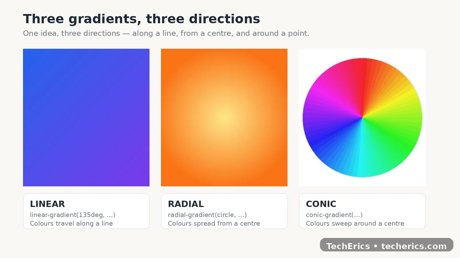
A gradient is technically an image the browser draws for you — it goes in background or background-image, never in background-color. That is also why it costs nothing to load: no file to download, perfectly sharp at any size, and changeable by editing one line.
The angle trap, once more
It is worth repeating because it wastes real afternoons:
| What you write | What it means |
|---|---|
| to top / 0deg | Bottom → top |
| to right / 90deg | Left → right |
| to bottom / 180deg | Top → bottom (the default) |
| to left / 270deg | Right → left |
| 135deg | Top-left → bottom-right diagonal |
If your diagonal goes the wrong way, you almost certainly wrote 45deg when you meant 135deg. The generator shows the preview live, so the angle question answers itself instead of costing you an afternoon — and the Color Picker helps you pick stops that do not go muddy in the middle.
Why gradients turn muddy (and how to fix it)
A gradient between two bright colours sometimes turns grey or brown in the middle — most often between complementary colours like blue and yellow. That happens because the browser blends in sRGB by default, and the straight path between two opposite hues passes through grey.
Three fixes, in order of effort:
- Add a middle stop with a clean in-between hue. A third stop at 50% gives you control over where the blend pivots, and it usually fixes the muddiness on its own.
- Blend in a better colour space. Modern browsers support linear-gradient(in oklch, #0ea5e9, #f59e0b), which keeps colours vivid through the middle. Put a plain sRGB rule first as a fallback for older browsers.
- Choose neighbouring hues. Blue → violet and orange → pink blend smoothly by nature; red → green almost never does. Subtle beats loud: gradients between neighbouring hues look more polished than opposite colours.
Banding: the steps you can see
A long gradient between two similar colours can show visible steps — banding — on some screens. Two things help: adding a third, middle stop, and using a diagonal (135deg) instead of a straight vertical fade, because the diagonal spreads the transition over a longer distance. A tiny amount of noise over the top also breaks the steps up, if you need it.
Gradient text and borders, done right
Gradient text is the recipe above: background gradient + background-clip: text + color: transparent. Two rules: use it for large headings, not body copy, and check the contrast at both ends with the Contrast Checker — pale ends can make letters disappear.
For gradient borders, put the gradient on a wrapper element with padding, and a solid background on the inner element. The padding shows through as the border. And pair any gradient with a soft shadow from the Box Shadow Generator — a flat gradient plus a soft shadow looks finished; a flat gradient alone often looks unfinished.
5 mistakes to avoid
- Writing 45deg for a top-left diagonal. It is 135deg. (Yes, again — it is the #1 mistake for a reason.)
- Putting a gradient in background-color. It is an image value. It belongs in background or background-image.
- Two opposite colours with no middle stop. Red → green, blue → yellow: expect grey soup in the middle.
- No fallback colour. If the gradient fails to parse, the element falls back to nothing. Set a solid background-color on the same rule first.
- Gradient text on small body copy. It looks clever and reads terribly. Headings only.
The short version
A gradient is a browser-drawn image: linear blends along a line, radial spreads from a point, conic sweeps around one. Remember 0deg points up and angles run clockwise, add a middle stop when the middle turns muddy, use hard stops for stripes and pie charts, and always set a solid fallback colour first. Do that, and your gradients stop looking cheap and start looking deliberate.
Build your next gradient in seconds with the free CSS Gradient Generator — presets like Sunrise, Ocean and Glow included, copy the CSS, no signup.
Frequently asked questions
Why does my 45-degree gradient go the wrong way?
Because in CSS, 0deg points up and angles increase clockwise. A top-left to bottom-right diagonal is 135deg, not 45deg. 45deg runs from bottom-left to top-right.
How do I stop my gradient looking muddy in the middle?
Add a middle colour stop with a clean in-between hue, or blend in oklch — linear-gradient(in oklch, colour1, colour2) — with a plain sRGB gradient first as a fallback. Choosing neighbouring hues instead of opposite colours also helps.
Do conic gradients work in all browsers?
Conic gradients work in all current versions of Chrome, Edge, Firefox and Safari without prefixes. Older browsers ignore the rule, so set a solid background-colour fallback on the same rule first.
Can I animate a CSS gradient?
Yes, but not by animating the gradient itself — animate the background-position of a large gradient, or cross-fade between two backgrounds. Keep animations subtle; a slowly moving hero gradient looks good, a fast one looks cheap.
What is a repeating gradient?
repeating-linear-gradient() and repeating-radial-gradient() repeat the same stops over and over, which is how you make stripes, checkerboards and repeating patterns with no image file.
Why do I see bands or steps in my gradient?
Banding happens when a gradient spans a large area with very similar colours. Add a third middle stop, use a diagonal angle like 135deg to spread the transition, or add a tiny amount of noise over the top.
How do I make gradient text readable?
Use it only for large headings, check the contrast at both ends with a contrast checker, and avoid pale colours at either end. Body copy should stay a solid colour.
Are CSS gradients better than gradient images?
Usually yes. CSS gradients load instantly, stay sharp at any size and are easy to change. Use an image only for complex textures that CSS cannot reproduce — and you can export a gradient as a PNG from the generator when you need one.